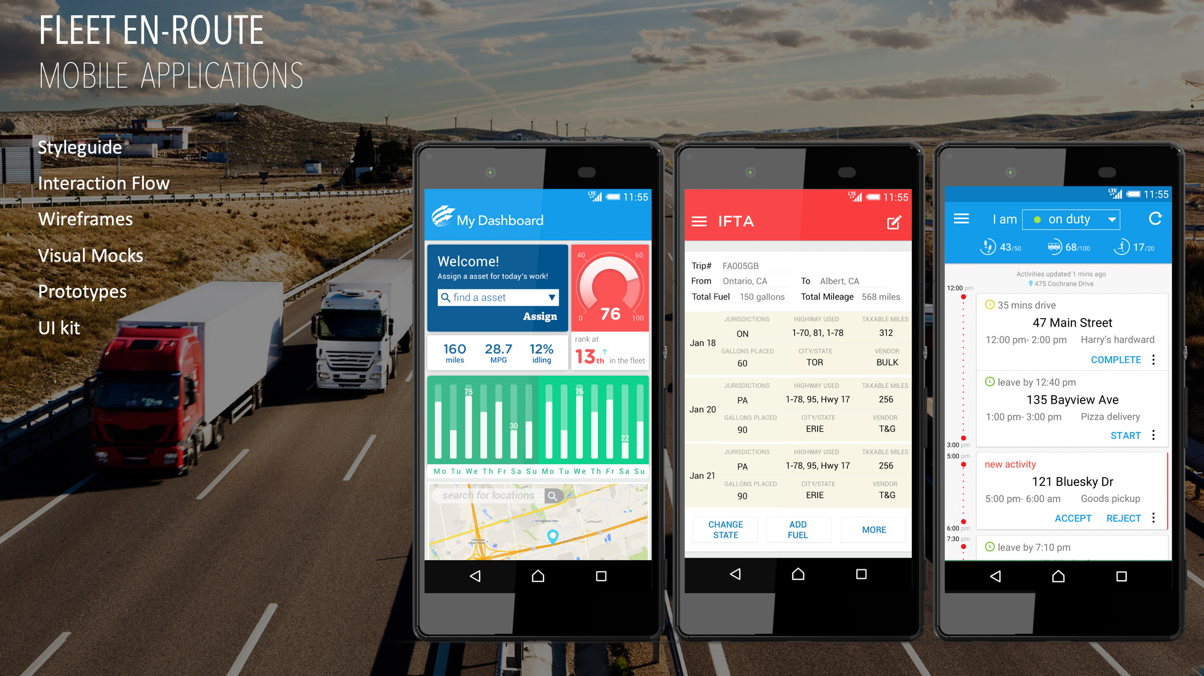
Problem Space — Brand New Mobile Apps
Fleet Management is a discipline within the telematics industry that requires digital products to support vehicle tracking, asset tracking, workforce management, safety compliance, delivery management, and dispatch. The complete B2B solution includes mobile apps for en-route workers and a desktop portal for backend office teams.
Path navigation to destinations.
Driving log creation and behavior scoring.
Dispatch task allocation and asset pickup.
Backend team support and communication.
Project Outcome
During the 6 months of design period, I worked closely with domain experts and the leadership team to define key value propositions for each app, develop UX concepts and design guidelines, and deliver information architecture, style guides, interaction flows, wireframes, UI kits, visual mocks, and prototypes.
My design work helped the company establish its mobile app experience strategy, extend its business offerings, and build a foundation for the next phase of feature development.
Research & UX Strategy
Domain Knowledge & User Study
Telematics was new territory for me. My priority was to first understand who the user groups were and what their use scenarios looked like — especially compared to the Fleet Management web portal we were building in parallel. Since transportation is a regulated industry, I also needed a solid grasp of safety compliance requirements. My methods included interviews with a regulation specialist, group discussions with product owners, and persona narratives for en-route workers across driving, transporting, and dispatch scenarios.
UX Design Tactic
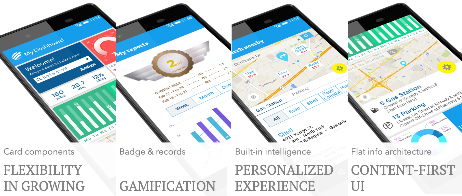
This was a brand-new build, so we had no historical web statistics to review. And since this was a SaaS business model, we wanted to minimize the learning curve for potential new users — mobile drivers. Considering most of them are not tech-savvy, the experience tactic I brought to the table was that the UI had to be self-explanatory and shallow to explore. I proposed a content-first UX model instead of a menu-driven model, so the actual content is surfaced directly on the UI to avoid interaction friction.
App #1 — Fleet Mobile Worker
Designed for long-distance drivers in logistics and transportation. The app helps them ensure assets are secure, vehicles are in good status, locate nearby service stations and parking, and stay aware of their driving behavior — all from their phone while en route.
Information Architecture
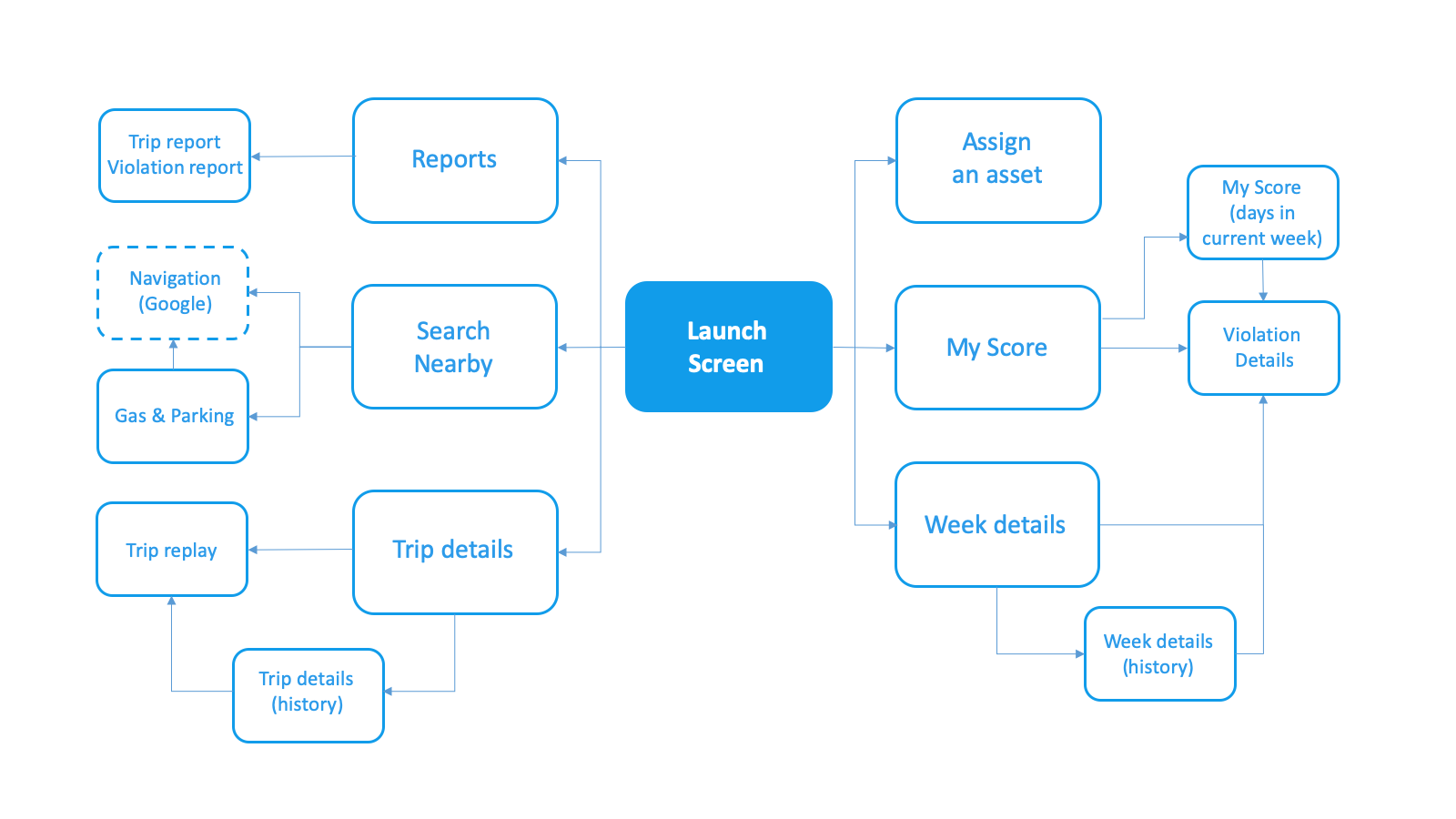
In detail, the app includes the following function and experience modules:
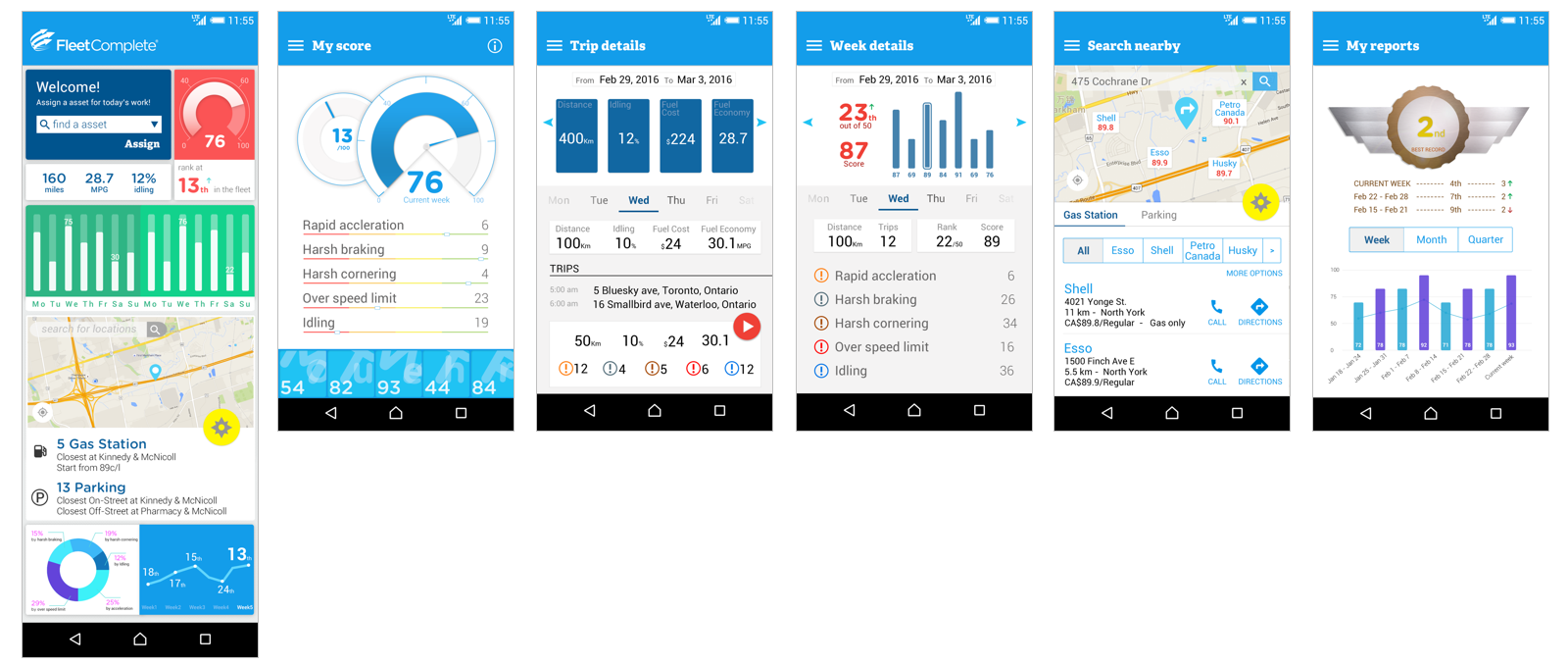
Trip statistics by week and day — distance, idling percentage, fuel cost, fuel economy, trip replay.
Driving behavior — driving score (based on rapid acceleration, harsh braking, harsh cornering, over speed limit, and idling time), rank in the fleet, trip replay for self-review.
En-route assistance — navigation to destination, gas stations, and parking spots.
Reports — trip reports (distance, idling percentage, fuel) and driving behavior reports.
Following the content-first design tactic above, the app's hero page serves as a content hub and a navigation bridge to the corresponding pages.
Visual Exploration
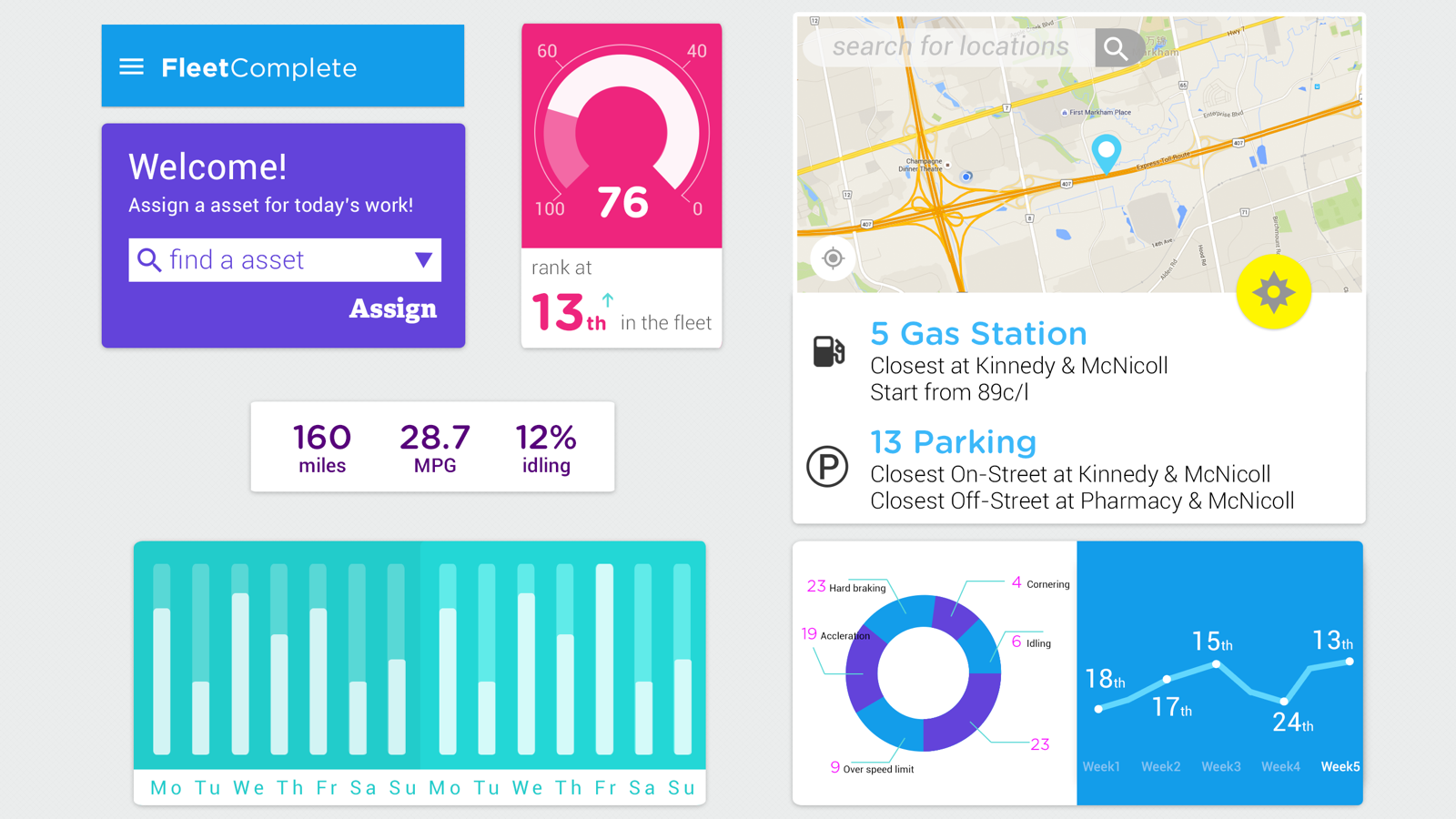
I created two visual directions, weighing company image, product character, and current design trends.
Visual Concept A — moodboard and exploration:
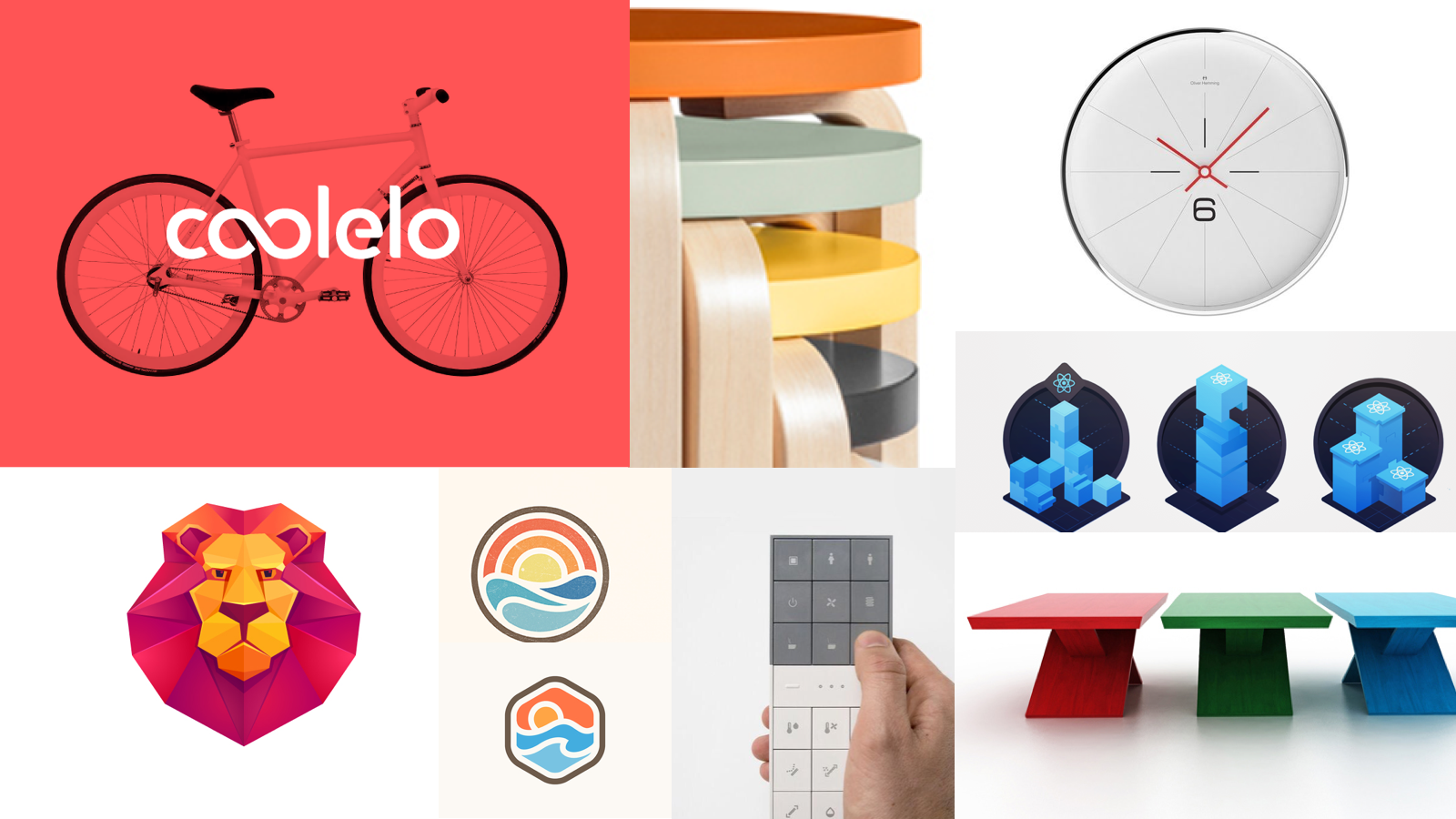
Visual Concept B — moodboard and exploration:

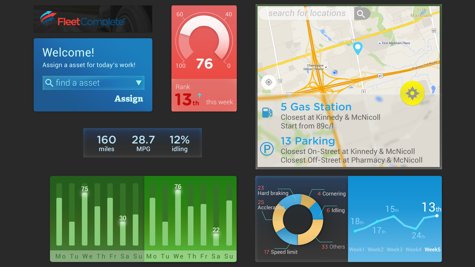
After discussions with the leadership team, we moved forward with Concept A, with further refinements.
Final Mocks
App #2 — IFTA Fuel Tax Reporting
IFTA (International Fuel Tax Agreement) requires carriers to report the fuel purchased and distance traveled per jurisdiction each quarter. This app helps carriers save administration time and eliminate manual data reconciliation — aggregating fuel transactions by location and fuel type into a pre-built compliance report.
Concept Ideation
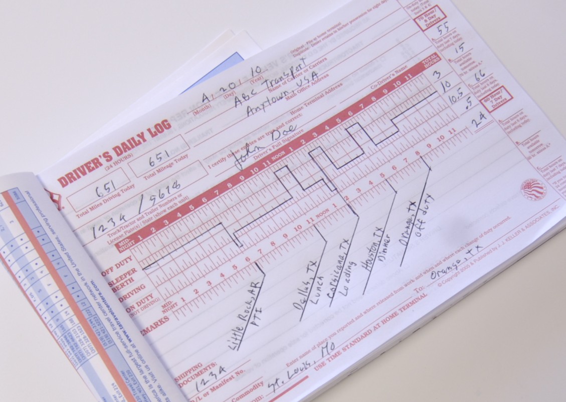
The overall functions were relatively straightforward. My ideation focused on how to minimize the learning curve for drivers moving from paper forms to a digital tool. I proposed using a paper log analogy — a form header for the trip overview, with line items for individual fuel consumption records — so the mental model would feel immediately familiar.
Concept Mocks
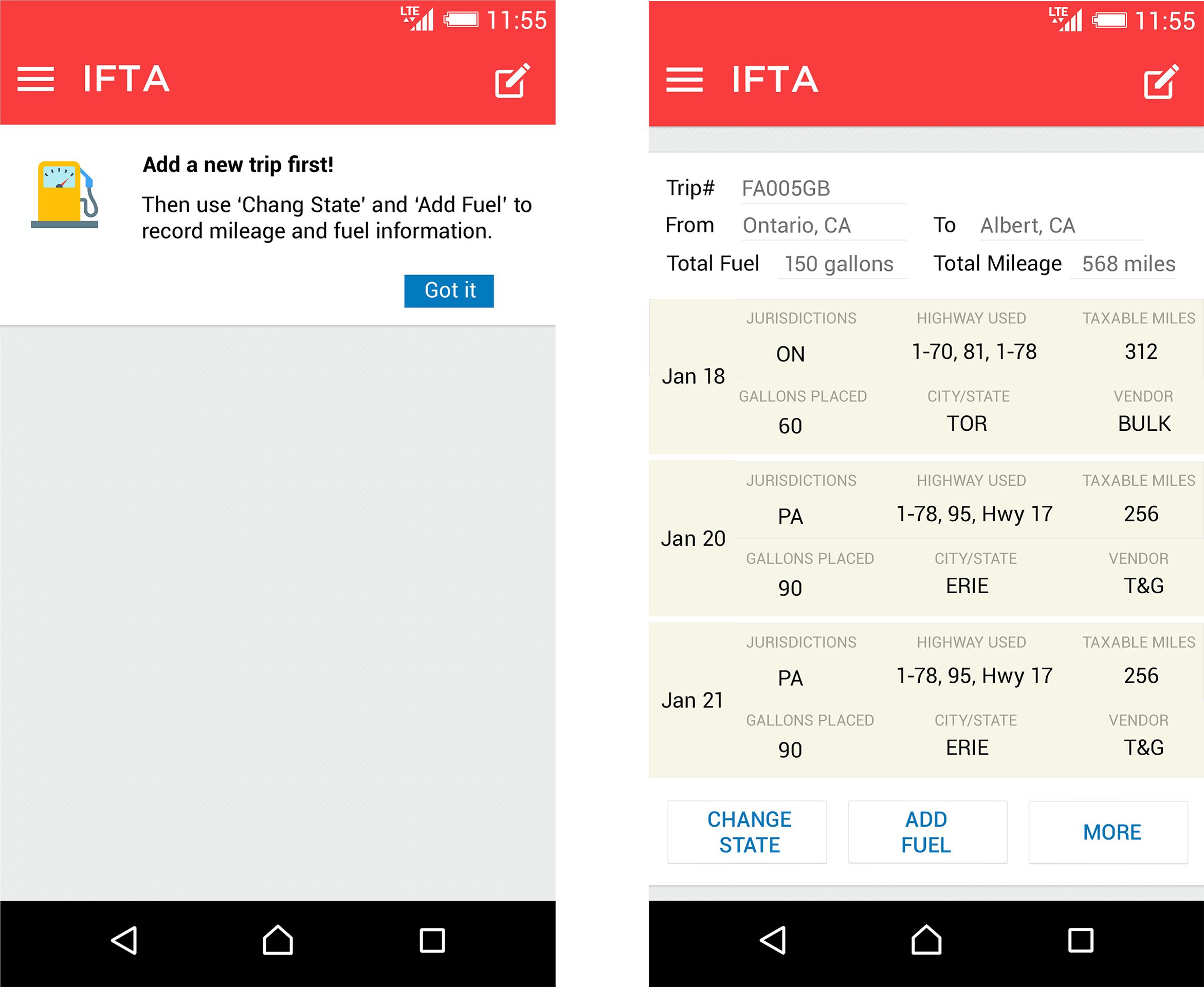
The experience model was that whenever drivers cross a state line or add fuel, all they need to do is press a button — the rest is automated.
Also, considering that vehicle drivers may not be tech-savvy, I designed an onboarding tip on the screen for first-time use, so they learn to create a trip first.
App #3 — Resource Tracker
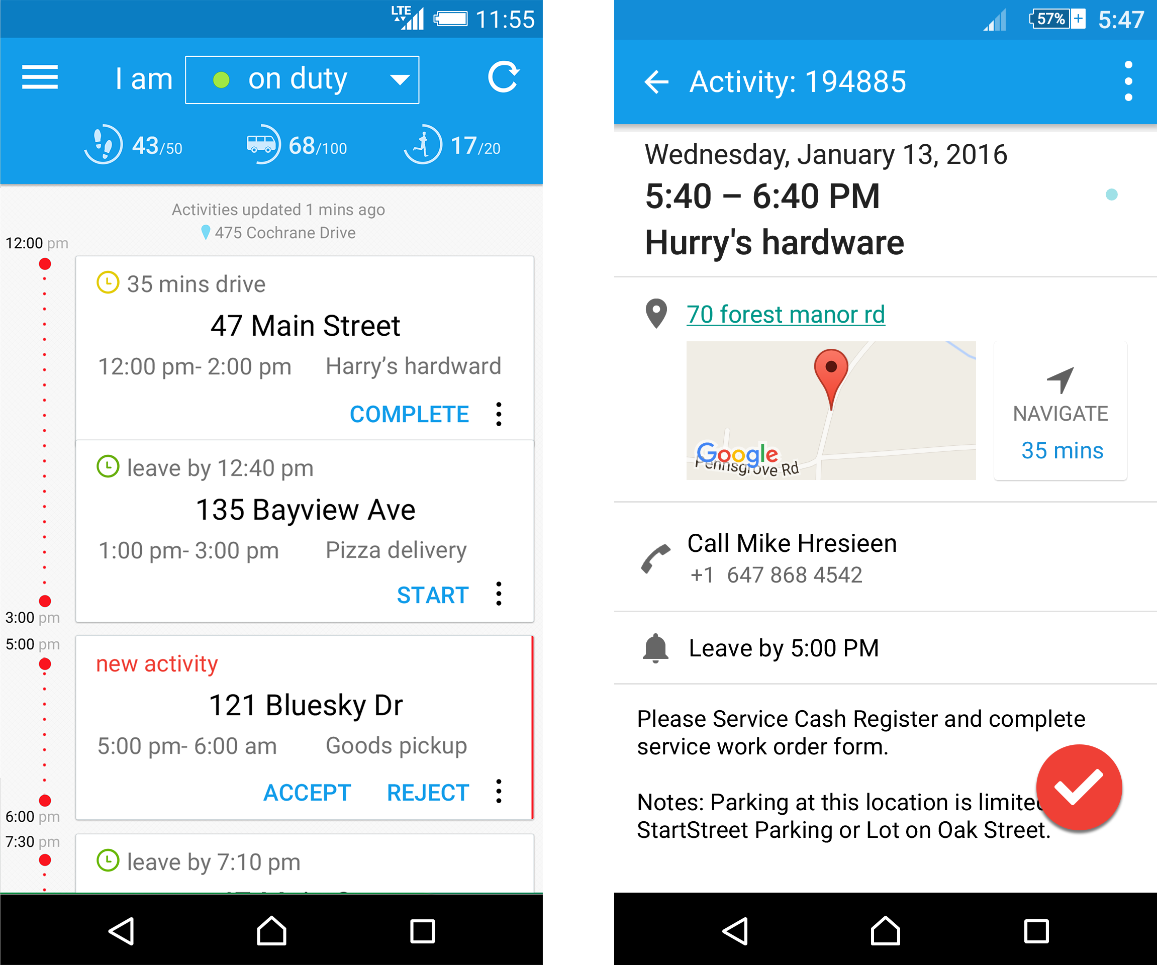
Designed for en-route workers who answer dispatch requests. The app enables users to receive tasks, start, complete, or reject them, navigate to destinations, and view delivery windows and contact information.
Design Challenge
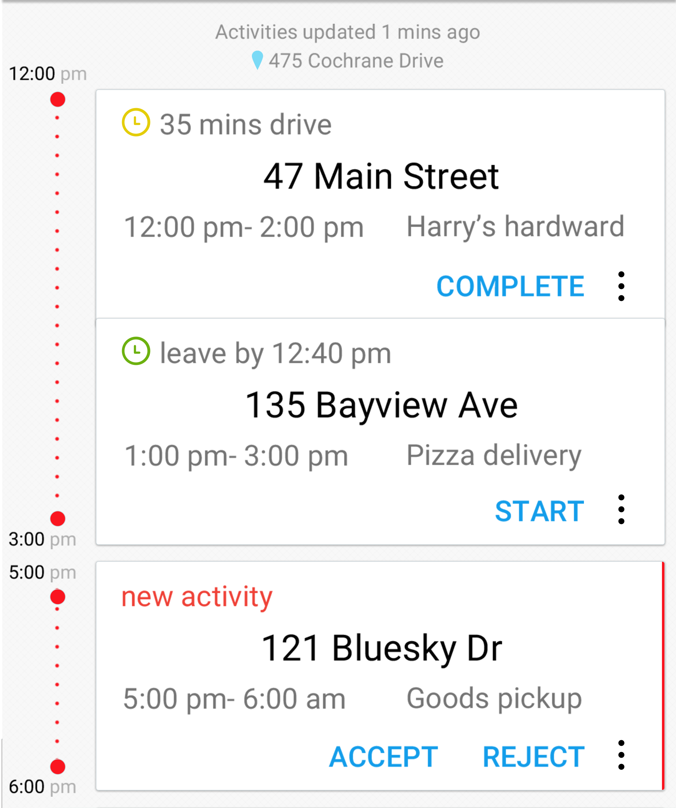
The main challenge was how to present dispatch tasks in chronological order when delivery time windows frequently overlap. After working with the development team to understand the backend dispatch algorithm — which optimizes assignments based on worker location and availability — I designed a loose timeline concept: overlapping tasks appear in the same time section, all in sequence. Completed or rejected tasks update in place.
The key to a usable experience was ensuring that available actions are always contextually accurate:
An upcoming task shows leave-by time and surfaces a Start action.
A newly dispatched task is called out distinctly, with an Accept or Decline option available for a limited window.
A second key function lets workers mark their status — on duty, on break, or off duty — so the dispatch system knows when and to whom to send new tasks.

Concept Mocks